Notes taken during CodeSchool course: Fundamentals of Design
All pictures are property of CodeSchool
Typography

Some fonts are just horrible. Invest in researching which fonts match your content and audience. Content should be both verbal and visual, depending on what needs to be presented.
Typefaces
Humanist
Serif = good for journalistic content

Sans Serif
does not have the calligraphy strokes

San Serif
Generally better for formal content, like science, data, etc.
Mix and Match is good, just make sure to contrast. For example, do not use same class � like serif + serif
Otherwise, don�t mix at all and just keep everything the same. Especially for scientific content, which may be better using the same so it focuses on the data and not the beauty.
Make sure you use web-licensed fonts
Font Size, Leading and Weights
Use visual hierarchy. For example, when using size the human eye naturally goes from larger font to smaller. Therefore, headlines are important use. Body copy recommended size is 16px. From that, each of the headings are a ratio from that body copy size
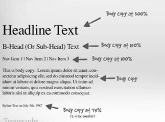
Leading = the white space between lines. Generally, this is set at 1.5, which is 150% of the body copy text size.
Weights = bolder text naturally attracts the eyes. These should be used sparingly for things like headings, and not in the body copy.
Line Width and Widows
Line width = measured in CPL (Characters per Line). CPL stays the same when text size increases, which means it will extend in width. This is controlled in CSS with max-width


Widow = single word on a line of text
Orphan = single line of text on a page

Try to avoid Widows and Orphans!
Color Theory
Subtractive Color = color you can touch (like red apple)
Additive Color = color you cannot touch (light on monitor)


Human determines color by HSL = Hue, Saturation and Lightness


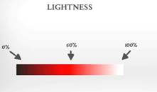
Bringing this together, this is how human color makes out different shades of red

Color Schemes

Base color = the color that will be used to determine all the other colors.
Red = heat, passion, excitement, energy
Orange = warmth, playfulness
Yellow = creativity, sunshine
Green = freshness, health
Blue = loyalty, reliability
Purple = Intelligence, Spiritually, Royal
Brown = Durability, class, age
Black = power, drama, bold, strong
White = cleanliness, simplicity, clear
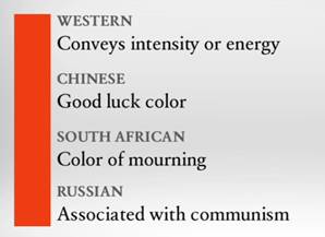
Keep culture in mind when choosing a base color
Some examples of color schemes:
Monochromatic
Same hue

Analogous

Complimentary

Color and Type
There should be high degree of contrast between the content and background. There are 3 ways to contrast based on color:


When contrasting on all 3 types, it becomes best to read:


One practice is to make the background progressively darker as it goes down

Layout
Visual Hierarchy
Users general read top left to bottom right, therefore good to put logo at the top left, then followed by navigation

Horizontal navigation is ideal when there are only a few items, though can also use a tier system. Vertical Navigation is not used that match � just have good reason to use it. The content should reinforce the hierarchy. For example, the man below is looking out thereby moving the user off the page. Rather the man should face inward, then giving flow to the page for the user


Secondary content should be kept to the sides. And add a footer which should always span the width of the page.
The Grid System
The structure guideline for contents of a page.
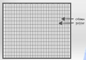


Avoid clutter by avoiding the gutters. Adhere to the grid
Fixed vs Fluid Grids
The grid changes based on size of screen or it stays fixed.
Whitespace and Balance
Whitespace doesn’t have to be white. Use it to draw the user in without over whelming them.


Symmetry


Balance all visual weights. Use symmetry.

Asymmetry can be used to emphasize certain content. Using it with a grid can help keep the page balanced, though not symmetric


The Elements of Web Design
User Discovery – UX vs UI

Personas
Personas = information about the user


Some ways to gather persona information
- Make educated assumptions
- Conduct a focus group
- Interview current users
- Hire research team
We need to first assume persona; this is shown above in the fake user Walter. We have defined Goals and Concerns for this user. It also has background information to help us understand the user.
Personas should be real person if possible, it will help empathize with the user. It also helps keep focus to who the user is and how we are to help them.
Design and Test
UCD = User Centered Design
Identify the feature
Understand why the personas need feature
Research how other people have solved problem
Sketch or wireframe ideas
Test design with users and audience
The 5 second Test
Asking these simple 3 questions
- What does this feature do?
- What do you like about it?
- What don�t you like about it?
Navigating Sites
Information Architecture
Think about subway train maps and airport gateway signs
Use of different text sizes and icons
Use of generic names
Four ways to find content:
- Known items (We know what we want and where to find it)
- Exploratory (We know what we want but not sure where to find it)
- Unknown (We don�t know what we want nor where to find it)
- Re-finding (Looking for what was already found / seen)


Try to categorize content into groups. The content should also be ordered by importance, giving items on the top more priority over the items on the bottom.

This will be used to create the site map, which gives the overall structure

Use the navigation to also highlight states � where the user is currently at. It can also be useful to have breadcrumbs of pages have dependencies.

People generally see only a small set of data on each page. They rarely go to the second page. So, it is important to put the most related content on the first page up front.
Usability Design
Forms
Try to stack labels above the input fields. Also, remove any unnecessary fields that the user does not need to add.

Best Practice � instead of making fields mandatory, just mark the optional fields. Users are more likely to complete the whole form in that case whereas when having required fields, the user will skip the optional ones.
Buttons
Keep buttons large and easy to click.
Confirmation Message
Use only when user is doing something that is irreversible � ex. Confirm deletion of older messages
Mobile Best Practices
Keep design consistent between devices. The content needs to look seamless. For example when reading an article on a desktop, then accessing it on a mobile, it should be marked as read.
Replace long text with icons. Use icons that a small and simple, without a lot of detail.
